New Articles on Urbanism in New York

The New York times published not one, but two excellent pieces this week that explore the transformative power of deprioritizing cars and prioritizing pedestrians and bikers on our streets. Although New York likes to think of itself as a great city like Paris, London, or Vancouver, New York has fallen dramatically behind on improvements to the urban space. I liked these two pieces because they harness our imagination to show how small improvements (a repainted street, a bike bridge) could help shape the city in which we all deserve to live.


Diagram showing how space that’s currently devoted to cars could be shifted to create more space for pedestrians (nytimes)

Diagram showing how space that’s currently devoted to cars could be shifted to create more space for pedestrians (nytimes)

A diagram of a complete street - with room for pedestrians, bikers, buses, shared transit (taxis), and cars (nytimes)

A diagram of a complete street - with room for pedestrians, bikers, buses, shared transit (taxis), and cars (nytimes)

Pre street improvements (nytimes)

Pre street improvements (nytimes)

Post improvements (nytimes)

Post improvements (nytimes)

I’ve Seen a Future Without Cars, and It’s Amazing - Farhad Manjoo

This is an amazing piece and worth checking out for the powerful graphics alone. I am a firm believer that simple and intuitive graphics (backed up with data and best practices) are one of the simplest ways of advancing the cause for a better city. When people oppose zoning changes or bike lanes, I optimistically believe that deep down they share our mission - a better city - but lack the vocabulary and institutional knowledge required to imagine the potential positive effects of the improvement and the possible negative ramifications of not improving anything. Graphics like this are going to start great conversations - I can’t wait to see where they lead.

I was very interested to see the that the url slug for this article was “ban-cars-manhattan.” The idea of banning cars is one that very few urbanists prescriben to… but one that is often thrown in our faces when we propose changes to the city. Giving the NYTimes the benefit of the doubt, I’d like to think that this was simply the most convenient way of abbreviating this longer headline. But my cynical side thinks the editors were being intentionally inflammatory to attract tens of thousands of angry comments!


New York as a Biking City? It Could Happen. And It Should. - Michael Kimmelman

This article explores a remarkable plan for a 425-mile system of protected bike lanes throughout New York City that was proposed by The Regional Plan Association (boring name but awesome work!). Protected bike lanes are one of the best and cheapest ways to encourage more people to use their bikes to get around. And as has been demonstrated by cities like Paris, the COVID pandemic is a huge opportunity to grow these bike networks. This was my favorite quote from the article:

Getting through this whole crisis depends on city leaders’ capacity to think ahead, not hunker down. Robert Moses, New York’s storied planning czar, plotted during the depths of the Depression so he could be ready when the money materialized. Whatever else one might say about Moses, he knew how to get stuff done.

Although it’s funny to find inspiration from a reviled planner like Robert Moses, in this he’s right. Now is our time to plan the city we aspire to live in - tomorrow we’ll make it happen.

Some of my favorite things in June

This has been a hard few months for everyone. I don’t need to reiterate everything that’s weighing on us - you already see it in the news, on tv, and in your social media feeds. Everything feels extremely important these days: the necessity to stay indoors to prevent the spread of COVID, the importance of protest against the murder of Black Americans by the police, the desire to support struggling local businesses and restaurants, and the deep craving for life to return to some kind of normalcy. We are pulled in every direction every day and how we choose to invest our energy is entirely dependant on our own calculus. My equation will look different than yours - and that’s ok. It’s important for me to note unequivocally that Black Lives Matter. But I’m not yet sure how I will bring this advocacy into my life. I have been reflecting on my values and I look forward to sharing more about how I intend to express them in my life and in the world.

But despite all this draining complexity, I find bright highlights in life . There are things on the internet that made me laugh, smile, cry, and think. I wanted to share a few of the things that I’ve found interesting this month. If I can get my act together, I would like to share some of these highlights monthly! Here it goes:

  • Transit, Density, and COVID. When COVID exploded in New York, many online commentators were quick to blame the city’s density and the transit system. Although this line of thinking quickly took over the internet and produced a seemingly endless series of takes on the “death of the city,” the assumed correlation between density and COVID risk was frankly wrong. Just look at cities like Tokyo or Seoul. Both have transit networks larger than New York. Neither shut down their transit networks during the pandemic, and - combined - these cities had a tiny fraction of New York’s case counts. What really caused the explosion of cases in New York was the failure of the government. So as people reconsider their commutes and how they get around, they shouldn’t be scared of transit. To learn more, read “Fear of Public Transit Got Ahead of the Evidence” by Seth Solomonow and Janette Sadik-Khan (the visionary director of NYC DOT who pedestrianized Times Square and other major urban spaces in the city).

 
Even though transit is safe, we should continue to invest in advanced bike and pedestrian infrastructure. I’ve loved the photos from Paris showing the extraordinary expansion of bike lanes in the city. (From Emmanuel on Twitter)

Even though transit is safe, we should continue to invest in advanced bike and pedestrian infrastructure. I’ve loved the photos from Paris showing the extraordinary expansion of bike lanes in the city. (From Emmanuel on Twitter)

 
  • The CHOP. For a while, it seemed like Seattle would have it’s own counter culture neighborhood. Despite how it was shown on the national media, the CHOP (Capitol Hill Occupied Protest) was a fascinating and mostly harmless experiment around collective action. As a firm believer that the streets are for people, I was excited to see citizens claiming the space that was theirs; But as a supporter and advocate for Black lives, I was a little confused how this occupation advanced the BLM cause. Regardless - judging by the number of “what’s going on with CHOP?” texts I got from out-of-towners, this protests generated tons of fascinating discussion among family and friends. Unfortunately, it seems like the CHOP is going to have a sad ending. There are shootings almost every night and even the protests most ardent activists seem to be losing steam. For the sake of the residents, and the larger BLM movement, I hope that the physical presence of the CHOP is cleaned up safely and its revolutionary ideas live on in other mediums. For their amazing coverage of the protests, I want to give a HUGE shout out to my favorite local news source - the Capitol Hill Blog.

  • The BNet Newsletter. If you like weird stuff on the internet, you’ll love this twice-weekly newsletter. I have been a fan of Brian’s since he was writing at New York Magazine. Come for the meta-philosophical discussion of memes and internet culture, stay for the weird tik toks and technology updates. One of my favorite recent issues was about how the K-Pop Stans ruined the Trump rally. Besides the fact that this was a wonderful, fascinating story in itself - hooray for teens expressing themselves and flexing their strength using technology! - Brian’s write up provided a ton of context about how this group of young people distinguishes themselves on the internet. If you need a laugh, check out this twitter thread of some of the videos that tik tok users created to spread the devious plan. Sign up for BNet and enjoy!

Biking in Europe and America

I will be the first to admit that I am a coward on my bike. I rarely get in the saddle unless the weather is impeccable and once I’ve started pedaling I stick as close as I can to the safest, most-protected bike lanes… preferably the ones in parks or greenways, as far as I can get from cars. I especially love the Burke-Gilman trail here in Seattle. Not only is it extremely well-protected from the city - it’s also very flat and easy!

 
Biking in Copenhagen

Biking in Copenhagen


All that being said, I’ve had wonderful experiences biking in Scandinavian cities like Copenhagen and Oslo. Not only do these cities have wonderful pedestrian and bicycling infrastructure, they seem to have a totally different civic philosophy around biking.

I recently read a wonderful piece by Dan Kois, How I Learned to Cycle Like a Dutchman. In the article, he describes how he and his family adapted to the bike lifestyle during a 3-month visit to the Netherlands. Although it took them a few weeks to adapt, Kois learned how to navigate the unspoken rules of the road. Eventually, he even learned to trust the cars, buses, and trucks around him, knowing that almost every one of those drivers was also a bicyclist themselves. Kois describes these psychological differences between biking in Europe and biking in the United States with phenomenal insight. I hope we can learn to bike more like the Europeans!

The Shape of the City

 
Frank Lloyd Wright’s Broadacre City (Image from CityLab)

Frank Lloyd Wright’s Broadacre City (Image from CityLab)


Whether I’m day dreaming out the window at my office or walking around running errands, I think a lot about the shape of the city. I am fascinated by the intersection of humanity, capitalism, and nature. Before building a city, us humans see a landscape with lakes, rivers, forests, hills, and valleys. For better or worse, we bridge the rivers, we flatten hills, we shape the shoreline, and we carve streets into the hillside. While we try to follow a plan - usually a grid - we often end up with a smorgasbord of layouts. Throughout this network of streets, we build all sorts of buildings shaped by the funny confluence of economics, policy, and aesthetics. While the natural world that we bulldozed emerges here and there in our parks, the weeds cracking through a sidewalk, and the bunnies procreating in my neighborhood, the business of human life builds through decades of routine. People make simple choices: What’s the fastest route to my job? What’s the most convenient form of transportation available? How far am I willing to walk for a little errand? These little decisions have huge consequences into how the city is laid out, valued, and built. And none of this is a straight-line: it’s a messy, beautiful mixture of many forces working in all sorts of ways we don’t understand.

I recently read this fascinating article in CityLab called The Commuting Principle That Shaped Urban History by Jonathan English. English explores the idea of the Marchetti Constant - the principle that most people are willing to commute 30 minutes to their job each day. In practice, this means “that the physical size of cities is a function of the speed of the transportation technologies that are available.” From ancient Rome to medieval European cities, the dimensions of the city were determined by how far someone could walk in 30 min - about a 1 mile radius. Fast forward to the 18th century when trains and streetcars were introduced to cities like Chicago and Philadelphia - now the city could grow in scale to accommodate new commuting technologies. Then skip to the mid-1950s when cities grew by another order of magnitude… this time determined by the scope of their freeways and automobile infrastructure. The car reigned supreme for half a century and created cities of massive sprawl.

 
The growth of cities based on the technology most people used to commute. (Image from CityLab)

The growth of cities based on the technology most people used to commute. (Image from CityLab)


The fascinating Marchetti Constant renders one of the many complex factors that shape our cities into an incredibly simple rule - a 30-minute commute. Although this phenomenon is based on quantitative data about the sizes of cities over time, if you look at it the other way, it suggests that a 30-minute commute is one that is reasonable and satisfactory for most people. More urban planning principles should be grounded in beliefs about a satisfactory city life - What is a reasonable proximity to parks? To public transit? To shops and restaurants? And to our neighbors? - instead of around which technologies are the most efficient or groundbreaking.

But when we do pause to think about the technologies that shape our cities, it’s clear we have to take a step back from cars. Since cities with robust public transit and pedestrian and bike access are not only more sustainable but so much more pleasant to live in, it is time for a fundamental rethinking of the shape and size of our cities.


Recreating History

Seattle of 1908 (Image from the Seattle Times)

Seattle of 1908 (Image from the Seattle Times)

Seattle of 2019 (Image from the Seattle Times)

Seattle of 2019 (Image from the Seattle Times)

While on the topic of cities and change, I also wanted to give a shout out to a semi-regular feature in the Seattle Times that I love. It compares historical photographs with their modern day equivalent. I loved the image that was shared today. In a city changing as quickly as Seattle, it’s sometimes hard to imagine the city 20 years ago and it’s nearly impossible to recognize the Seattle of 1908, but it’s wonderful to imagine what it would have been like. So many things we take for granted - how did you even get to Mercer Island without the bridge!? - are not yet built. Comparing the historical photograph taken somewhere in Fremont with the modern recreation, not only are the forests gone and the shoreline changed, but an entire bridge is blocking the view! In fact, the Seattle Times photographer describes how it is impossible to perfectly recreate the photograph because of the buildings and physical changes! Wow - how fast the city changes! I can’t wait to imagine the next 20 years!

Torre Reforma

From the second I landed in Mexico city, my eyes were searching the skyline for this tower. Driving from the airport at night, the skyline was dark but I could still see this bold geometric form. And lucky for me, I could see a sliver of this building from the balcony of my airbnb!

 
Torre Reforma.jpg
 

Torre Reforma

Walking down Paseo de la Reforma towards Chapultepec Park, one comes across a pale grey, slim silhouette rising like an obelisk over the wide avenue. This side of the building and the side facing away from the street are covered in a heavy-duty composite material. A series of small cut outs runs up the side of the building, presumably providing just-enough light for utility rooms and bathrooms. These cuts are made without a clear pattern and I would bet they were derived from an algorithm rather than the human hand. But like the paper tape from an ancient computer or the scroll of a clockwork piano, these cuts produce an elegant, unifying melody from bottom to top.

This facade is incredible to me. When skyscrapers around the world are competing for transparency and the amount of glass they can use (see Shanghai Tower), it is daring to see two huge facades fully covered in such an opaque material. And both of these facades are so monumentally flat - as if to demonstrate a geometry lesson of the infinite mathematically plane. This rich, heavy material is tangible in a way that glass towers can’t be - too often melting into the sky and clouds. And I love the material choice itself. The color is vaguely tan, as though it was just baked from the sun. The material seems perfectly adjusted to the climate, and didn’t have any stains from heavy rain or pollution (both of which I experienced). For me, this material is evocative of traditional Mexican designs - like a pueblo ranch or an Aztec pyramid.

Torre Reforma 2.jpg
IMG_1022.jpg

As you move around the building, you’ll notice the slant at the top of the building, which folds one facade into the other. This brings the building to an elegant peak and unites both opaque facades. As you pass the building, you find that the heavy facades provide cover for a contrasting facade. This facade is covered in crystal clear glass and is stacked into 4 story segments. Each segment has the huge V support beams front and center and each floor is lined with black louvres, which would shelter the interior offices from bright sunlight. Halfway up the tower, the facade is pushed in to make room for an open-air garden. The segments, the steel beams, and the louvres unify this entire facade but provide enough rhythm and movement to keep it interesting.

From the base, you notice something even more incredible: The slant at the top of the building - which brings together the opaque facades - also generates a beautiful twist to the structure of the building. The triangular supporting beams that shape the front of the building gently lean outward and leftward to meet at the peak. This is my favorite kind of modernism - designs deeply informed by utility, logic, and engineering principles, but transformed with thoughtful and artistic design considerations.

 
IMG_1663.jpg
 

When you reach the base of the tower, you’ll find that it hovers over an ornate, 2 story building from the 1920s. The glass of the lobby gracefully accommodates this older building, which was fully restored and slightly moved so that it would fit together with it’s much taller neighbor. Today, the building houses a restaurant and a member’s club. Together, these buildings say so much. One is old, ornate, and heavily European-influenced, and the other is a sparkling new, modern design emblematic of a new Mexican Architecture. It takes a local firm to understand these nuances and I love that this tower is the product of a local Mexico City based architecture firm. While the team clearly understands the materiality and rhythm of the city’s vernacular architecture, they are clearly equally comfortable using innovative engineering, advanced computer-aided design, and cutting-edge production to design something extraordinary.

IMG_1667.jpg

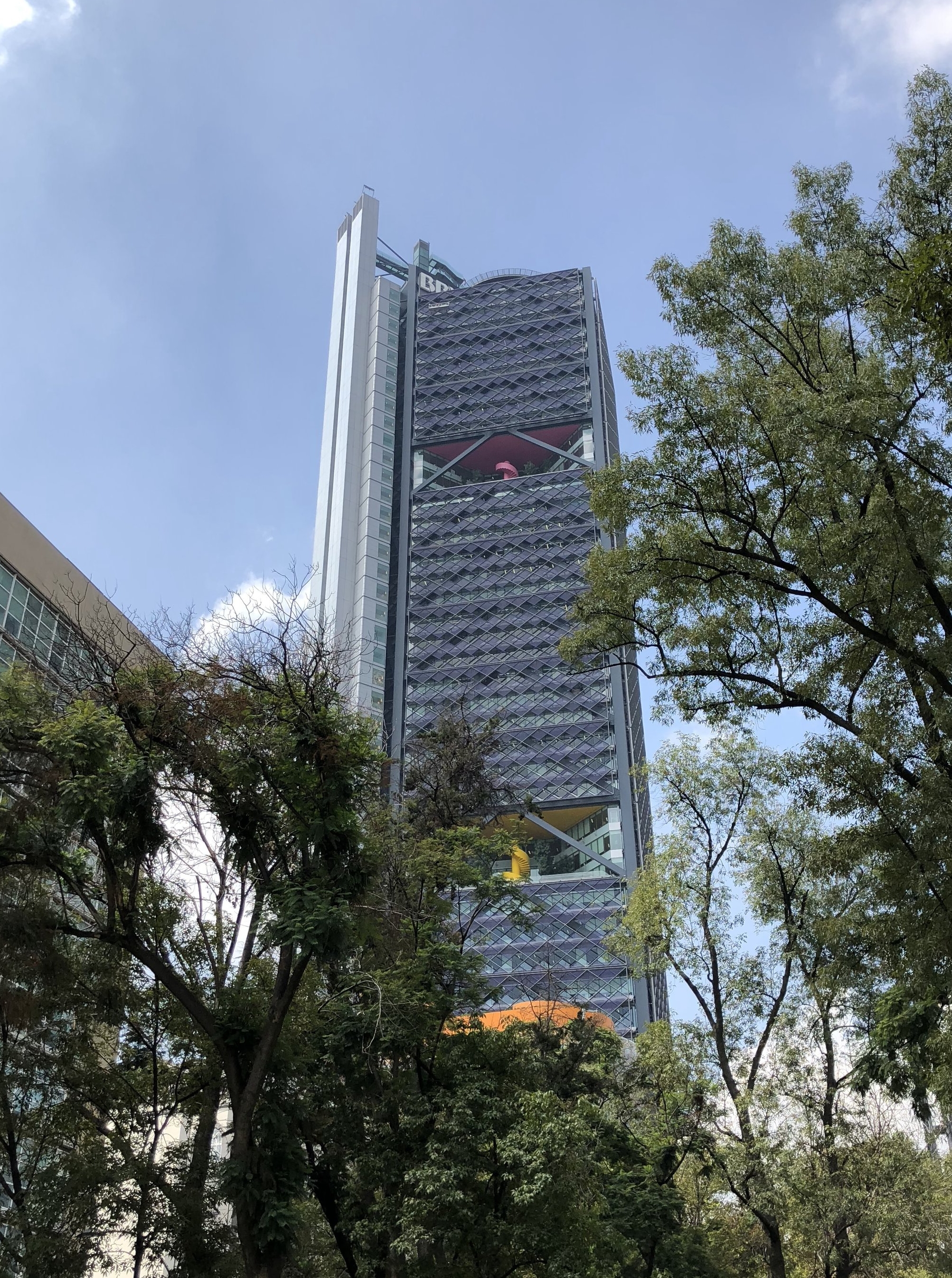
This is a risky design that pays off. While the Torre BBVCA Bancomer is an exceptional modern office tower that would befit any international city, I think the Torre Reforma is a uniquely Mexican tower. As Mexico City grows up, I hope architects - both Mexican and international - are encouraged to explore the rich architectural history of the country to create new typologies of the high-rise. Without a doubt, this is my favorite North American tower of this decade. For some great professional shots of this tower, check out Dezeen.